«Either I’m dead or my watch has stopped.»
Groucho Marx
I’ve already castrated my Apple Watch. As written in this posting:
The factory settings seem to have envisioned this thing as a constant interruption device. So first of all, disable all notification that aren’t from human beings you care about (for me, that list is shorter than the number of fingers on my hand, part due to emotional ties, one person because she pays my salary).
It also only shows the screen when I tap on it (otherwise, the information would be a distraction). It uses vibration instead of sound, etc. So it’s already something that serves me instead of distracting me. After all, it’s on my wrist, immediately on my body, way in the intimate zone. Currently it’s only my core family that can «tap» my wrist to inform me of something. The only other taps come from calendar alerts I do not want to miss.
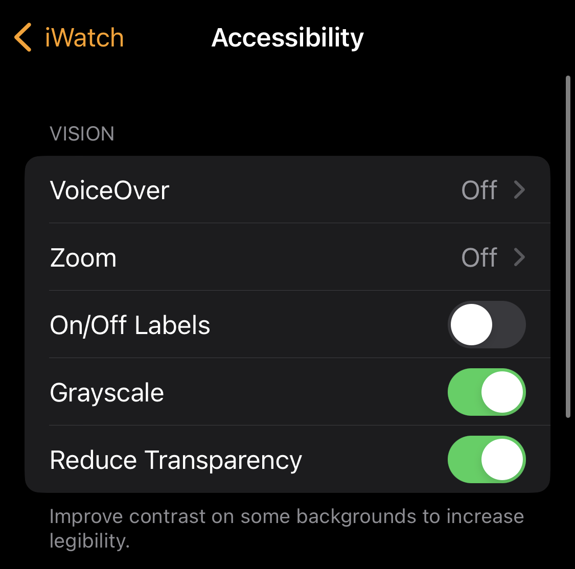
Recently, I noticed that you can use the accessibility features to make it even less distracting. If you open the accessibility features on the paired iPhone Watch App, you can select Grayscale. No more candy-colored icons but a very muted grayscale experience.
I also enabled hourly chimes but also disabled the sound output. The effect is that the watch vibrates (two short taps) every hour. In a sense, this is a distraction. On the other hand, I become a bit more mindful how I spend my hours. I’ll probably remove it in a while, but for the moment, yeah, something I like.
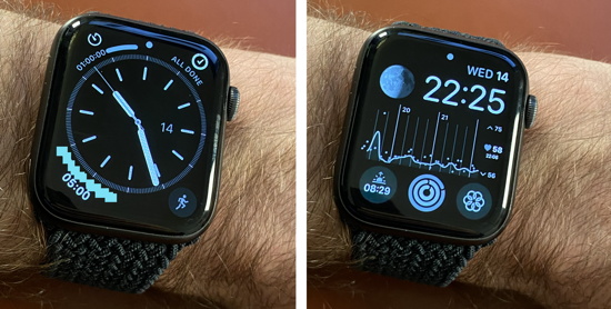
Hmmm, much less distracting.