«It started out as a scrapbook and just kind of mutated.»
«What is it?»
«I call it the Wall of Weird.»
[Cut to a wall of all kinds of newspaper clippings and photographs. Chloe stands in front of it and spreads her arms out.]
Chloe and Clark in «Smallville»
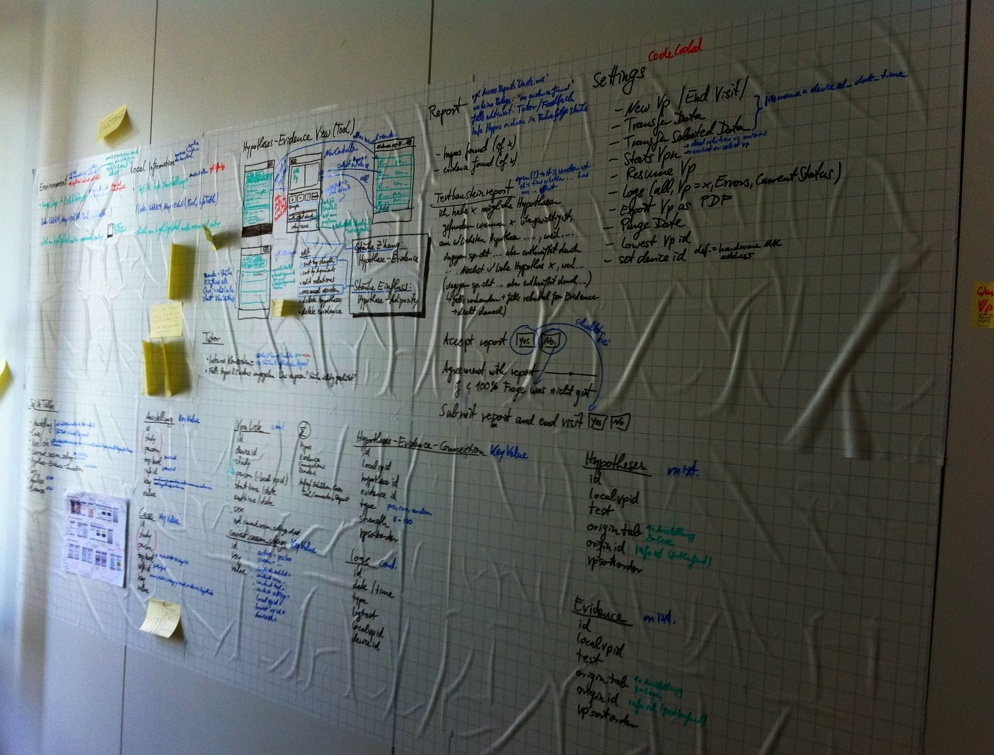
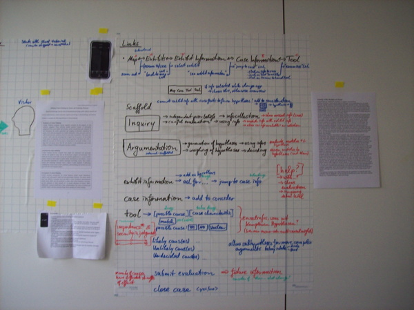
During human-centered design, a lot of students have problems making sense of the initial analysis phase. They have collected a lot of information about the prospective users/user groups, the problem, the tasks, the context, both regarding time and place and regarding the organizational constraints.
But how do they go from there? How can they make sense of all the data and information?
I find it really helpful to just “build the wall” (some kind of mixed-media affinity diagram). Just
- take a large wall in your home or office
(you might want to put Magic Chart sheets on it first), - start externalizing what you know,
- put it all on the wall, and
- start to cluster the information
(horizontal = group, vertical = argumentative/red thread)
and fill in any gaps you notice.
You already have the groups (users, problem, tasks, time-space-context, organizational context), so it’s rather straightforward, and you can use the vertical dimension to build the argumentation (essentially turning it into an outline).
Why a wall and not, let’s say, digitally? Because you need the space. Most topics are complex and the aspects relate to each other. When you have it all on the wall, you can literally step back and look at it from another angle. You can walk in front of it and add information, or resort it easy. And the walking around really helps.
I’ve used it in different contexts and it — always with a caveat — works for me:
So, yeah, highly recommended.