Don’t try to tell the customer what he wants. If you want to be smart, be smart in the shower. Then get out, go to work and serve the customer!
Gene Buckley, President, Sikorsky Aircraft
DEVONthink is the fundamental building block of my digital knowledge base. I keep my files in databases like “work”, “non-fiction”, “fiction”, “rss-feeds”, “notebooks”, and the like. The ease of use, the knowledge where something is (at least, in which database, which you can search separately by name, content, etc.), the easy sync to my iPad (DEVONthink 2 Go companion app), and much more … just brilliant.
Until they fucked up their iOS version by not calculating how much disk space preview images require in large databases (tens of GBs, apparently). Followed by missing features in their latest Mac software release: DEVONthink 3.0.
I really want to like the new Mac version, and yeah, I already bought it (so much for blind trust). But unfortunately, some people at DEVONthink seem to think they know what their customers should want. And judging by the discussion in the forum, they seem to think they should not want a Three Panes View (image blow, the two columns on the right, the rightmost one further separated in top (files) and bottom (content)).
Yep. A “simple” view on the data is what makes DEVONthink 3.0 currently unusable to me. Here’s the issue in a picture (doesn’t make that much sense unless you use DEVONthink).
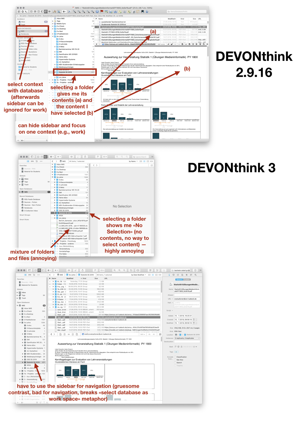
The new way of using a fricking sidebar for navigation within a database — actually expanding the folder structure — is just … wrong. It’s a sidebar. It does have its uses, for selecting databases, i.e., the context, but then being able to focus on the content. Now, you have to use it to get to your content.
This isn’t just “this is new” = “this is not how I am used to it” = “I don’t like it”. This is a different way of interacting with the data. It breaks the distinction between context (databases, sidebar on the left, easy to hide) and content (folders/groups and files). Now, DEVONthink is more like Mac’s Finder, no matter its advanced functions. It loses its unique selling point to me.
Which is a shame, because so far, my experience with DEVONthink and my interactions with their support staff were positive. Very positive. The “Hey, is there a way to group website clippings (PFDs) by URL.” resulting in “Here’s a script that does just that.” kind.
But those last two experiences, damn, where are they heading?
It’s one thing to forget to calculate preview file sizes. Okay, can happen, focus on one thing (narrow view on one problem), creating another. Here’s hoping for an update. Space on iOS devices is very expensive.
It’s also okay not to notice that many people depend on the Three Panes View. It’s not something people would say in an interview or user study (I’ve advised enough students in conducting them to know what they miss). The users just use it if they actually work with their own data. Not everyone, but a substantial amount of users. But it’s invisible/hard to verbalize, because it’s a view you select while you interact with the files and folders. And it’s with the files and folders where the action is. But it wouldn’t be possible without this view.
Nope, the really … discouraging thing is ditching something that clearly separated DEVONthink from Mac’s Finder, and then arguing in the forum that it’s better this way. That users should change. That something else is almost the same. That people (apparently at least two people) were confused about the view and did not see any use in it.
Ignoring user feedback and then trying to argue with them, to show them they don’t really need that feature? That way lies bankruptcy.
And DEVONthink is too good and too useful to end this way.
And yeah, by all means, give people what they need, not what they want, but listen to them when they tell you what they want … because they did use it, now notice they miss it, and the new method is just … wrong.
After all, DEVONthink is a productivity software. They shouldn’t try to push their ideal workflow. It works for them and that’s okay. But users are heterogeneous. They differ in their needs and workflows. No matter how proud they are of their sidebar. They should just allow for the workflow of the actual users. (And yeah, I’ve come to wonder how many actually use DEVONthink … these two fuckups should have been noticed within the company.)
So, at the moment, I wouldn’t upgrade to DEVONthink 3. At the moment. But I’d monitor what they do next. I’m still optimistic they fix those two issues. And even if it’s hard (And I don’t make it easy, criticism never is, esp. if it gets emotional. This is like a really useful and trusted tool suddenly falling apart. It’s not fun for me either.).
And yeah, I really hope they don’t go with their ego, but continue to do what made them an excellent company: Provide really useful software — for their users.
Well-said Daniel.
I spent the whole day yesterday upgrading to DTPO 3 and then downgrading back to DTPO 2 and will, as you mentioned, keep monitoring the future DTPO 3 updates.
Besides the lack of he three-pane view, the lack of an optional “light mode” prevent me from upgrading the software. My rtf files with large amounts of colored annotations are simply non-discernible with the black background and, apparently, there’s no way to turn it into white. I share your disappointment.
Thank you … hmm, didn’t notice that much of a difference with the rtfs … view looked slightly different, but the background color was white. Was the dark mode enabled? E.g., in the OS (System Preferences > General > Appearance)?
Hi,
Yes, the system is in “dark mode”. Regular text files background color in DTPO 3 is white but that’s not the case with rtf files. Per DTPO forum administrator it’s impossible to turn the rtf background color into white at the moment.
Please take a look at the following discussion: https://discourse.devontechnologies.com/t/difficult-to-read-links-in-dark-mode/47876/15.
I’d appreciate if you have some hints on this matter.
Regards
I totally agree. I couldn’t believe the three panes view wasn’t available anymore, so I contacted the support. I told them that it’s very bad news and that I hope they’ll reconsider.
I’d also add that the new labels are barely visible in dark mode.
Despite this, because DEVONthink is key to my work, I’ve bought the new version. I really hope they’ll fix all this because the previous license I used for the upgrade will stop working in 3 months.
You make a good case for the three-pane layout, but for me that was always one of the most confusing and unintuitive things about DevonThink. The problem is that it didn’t really behave the way the average person would expect. In the first pane, you could see subfolders but not files, even though files might literally be present there inside the folder. To know whether or not there are files in that folder, you have to look somewhere else entirely (to the next pane). I can see this being a major source of confusion for many new users, because the rest of the interface looks and behaves so much like the Finder, except for this one atypical behavior.
I think the DT3 solution does make a lot of sense to be honest. We expect the sidebar to behave differently (you point this out in the text), and so it’s the “perfect” place to have an unusual behavior like showing folders but not files within those folders. Your criticism of the sidebar for the visual contrast issue is mostly aesthetic rather than functional (and I do think you have a point there; it’s been a perennial design issue for OS X in recent releases, though some of the Catalina apps are making this a little better by bringing color back into the sidebar).
For advanced users they probably should have left in the option to have the old-style layout. Not disagreeing with you there.
Hmm, the issue is the with underlying mental model. For me, seeing (sub)folders and not files makes perfect sense. I narrow down my focus more and more. I don’t want files in the (sub)folder view, they are confusing. Additionally, once I have selected the general context (database), I want to dig into the contents themselves (folders, files and file content). It’s hard to verbalize, because it’s mostly on a perceptual and procedural level.
What I find particularly annoying — esp. coming from an — so far brilliant — company like DEVONthink is their support trying to argue that the Three Panes View is no good. Or that there are other features that are new and cool. Who care’s? It’s an issue of perception and mental models, and ultimately workflows. And I seriously wonder whether they are losing their touch. And yeah, they may think they are right, but this isn’t a question of right or wrong, because it depends on the user. And if they don’t see the diversity in their user base anymore … damn, that’s really bad.
Interesting comments on here. I was “away” from DEVONThink for a couple of years, and I came back into the fold after the passing of Bill, the super-useful man who answered questions on the board there.
What I immediately noticed is that the new guys answering questions are smart-assed and argumentative as hell. If you question something they’ve done, that one guy (Frog something) acts like you’ve attacked his mother or something.
Hmmm, I wrote another posting about DEVONthink’s support and quoted some answers in the forum … by Bluefrog (left out the name, because I did not want to make it personal). But yeah, in contrast to the other person (who apparently writes under his/her name), this person is really bad at support. Checked another issue and his answer essentially was: “No, this isn’t a issue, because it works for other people so it only happens to you.” (paraphrasing). If it’s only the support side, that’s one thing. But if people with this attitude filter information, e.g., during a staff meeting reporting about the issues raised in the forum, then DEVONthink does have a serious problem regarding the veracity of information they get. And yeah, ego is bad for a developer, and deadly for support.
I totally agree, I want the 3-Pane-View as well!
Making it worse, I can’t make Devonthink 2 run again- it won’t start at all.
Mine still works but it sucks nonetheless.