I started to re-organize my wiki a few weeks ago. I think that any structure must be changed after some time, especially if it works as an external memory and archive, because life can hardly be planned in advance as it later happens.
There were three major changes due to the reorganization: I realized the importance of chronological index lists, I use a more differentiated Navigation-Image-Map on the Start Page, and I changed from (Sub-)Headers to Bullet Point Lists for Hub-Pages.
1. I realized the importance of chronological index lists
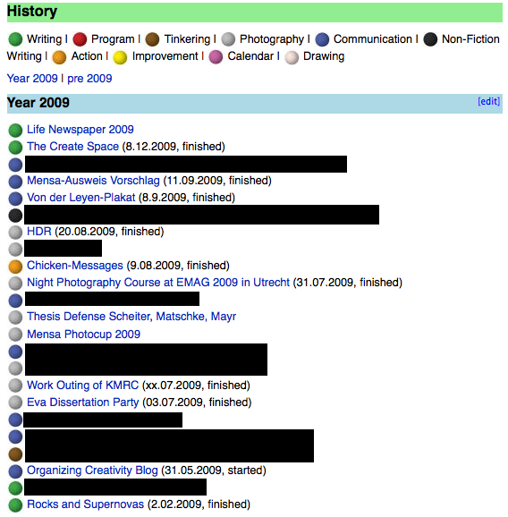
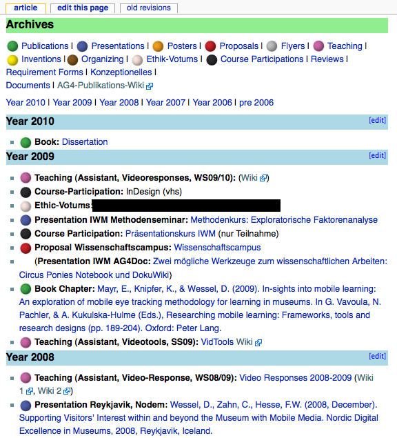
I use them to get a quick overview of my private projects and (separately) of my projects at work. This kind of list is great when you want to see what you have done during the past months or years. While the work projects have an additional more detailed overview page depending on the kind of project (e.g., all presentations, all articles, all posters), this list shows only one line of condensed information for a quick glance. Of course, the links lead to the projects themselves, not to the overview pages (they can be accessed via the links on top of the page). The balls essentially are smileys — you need to add entries to the conf/smileys.conf and add the images to lib/images/smileys in DokuWiki. They are great for a quick visual impression of what you did.


2. I use a more differentiated Navigation-Image-Map on the Start Page
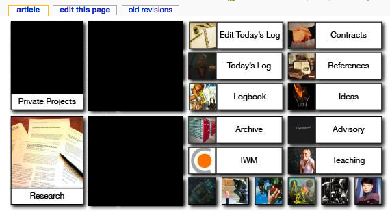
I also changed the first page to quickly access the pages I need most often, or jump to the hub pages one click away from those pages. I used InDesign for the navigation image (it’s an image map that uses the HTML-Tag of the DokuWiki Syntax. Especially for the first page a graphic representation of the links is very useful, although I learned from experience that too many graphical representations soon become confusing.

3. I changed from (Sub-)Headers to Bullet Point Lists for Hub-Pages
I reduced the usage of headers due to the amount of (vertical and horizontal) space they cost and switched to bullet lists. This way I can use the screen space more effectively. This might not sound a big deal but if you have to scroll each time you open a hub page or have to click on the table of contents, it becomes tedious soon. Now I read vertically until I find the category I need, then horizontal for the necessary detail level or year.

What about you?
How do you structure your wiki? Drop me a line — either per eMail or per comment.