Clothes make the man. Naked people have little or no influence on society.
Mark Twain
Heterodox Academy continues to be a light in the present endarkening (see also posting here). It states its mission as: “To increase viewpoint diversity in the academy, with a special focus on the social sciences.”
Or to quote their statement:
“I believe that university life requires that people with diverse viewpoints and perspectives encounter each other in an environment where they feel free to speak up and challenge each other. I am concerned that many academic fields and universities currently lack sufficient viewpoint diversity—particularly political diversity. I will support viewpoint diversity in my academic field, my university, my department, and my classroom.”
They have recently created a College Care Pack (which is worth examining) and opened up their memberships to tenured professors. And I really like the idea of trying to ensure “institutionalized disconfirmation” as Prof. Haidt put it in a Dave Rubin talk (part 1, part 2). Even Especially cherished ideas should be challenged — in a fair but critical discussion.
So it looks like things are going well for them. They are spreading the word and recently have started to create apparel and other material in support of viewpoint diversity (on cafepress).
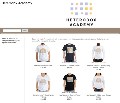
But frankly, while I like the overall idea of the apparel, I’m neither a fan of the logo (with the text “I support viewpoint diversity on campus”) nor of the color scheme. Plus, the squared white background on a black T-Shirt is a personal design no-go for me. Sure, design is hard (hey, I’m a psychologist), but I also think there is room to grow.
Because … after having a look at the T-Shirts … I was wondering … why didn’t they use the “viewpoint” logo on maps as a basis … and the color wheel? And why the whole sentence? If you are for something, just state the terms you are for. And there is no need to limit it to the campus. If you wear it on campus, you are obviously for it on campus too.
So — a bit inspired (damn lack of sleep) — I played around with Keynote and GraphicConverter (totally the wrong programs, but my old InDesign version did not survive the update to El Capitan and I am reluctant to use cloud programs). After creating a logo, I checked the designs by using Zazzle (without actually logging in, just to see what their preview looks like).
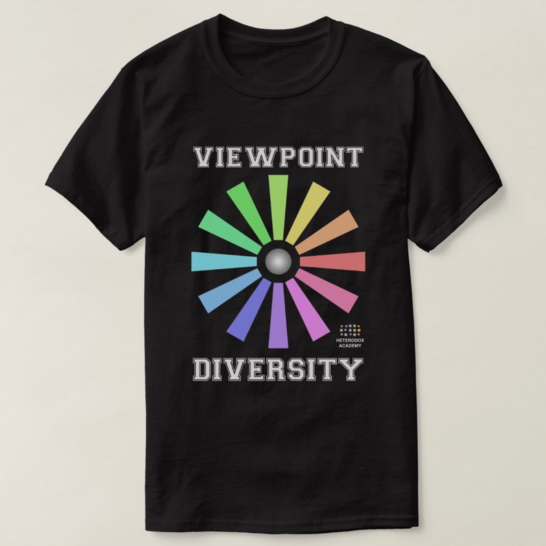
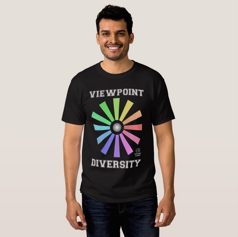
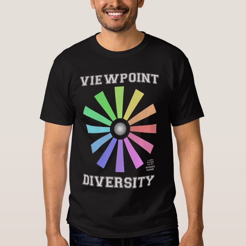
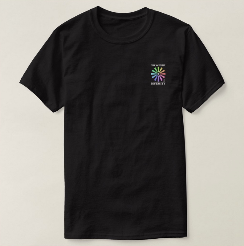
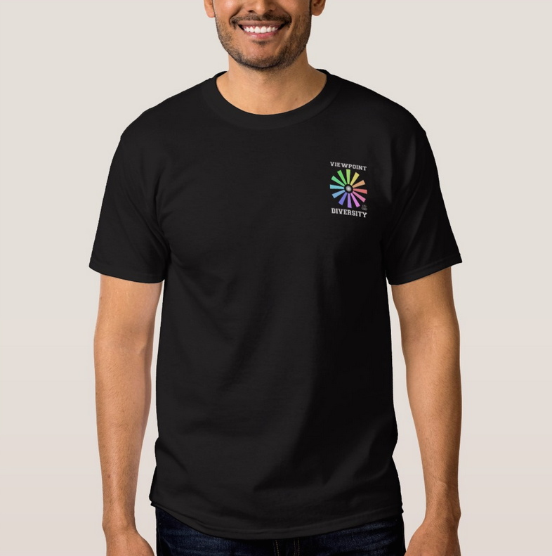
The result (quick and dirty, but there you go, images via Zazzle’s preview function) — first a screaming loud version, then a discreet one:
Full Sized Logo (screaming loud)
Pocket Sized Logo (rather discreet)
Just an hour or so playing around, but, yup, I like it (the discreet version). And I wanted to preserve it (and show it, I admit ;-)). Even given this is a completely unauthorized design using their logo — I just wanted to see how it would actually look like.
And yup, there is also lots of room to grow with this design. After all, it could be confused with gay pride. (Using only the color scheme of Heterodox Academy would take care of that, but I find the colors starkly limited. Plus I like the metaphor of colored perspectives on the same issue — ‘point’ — which is in shades of grey.) And gradients might be interesting for the beams itself — or some pattern (like stone, akin to the Keynote advanced image fills). And the text could be curved, but that seems to be a no-go in Keynote (oh, InDesign, how do I miss thee). Plus no idea whether someone already came up with this kind of logo. Or whether the font was copyrighted, etc. (like written, actual design is hard).
So, yeah … I think there is room to grow with their designs. Might be a good project for a design course or something.
But also … frankly … the design is an important issue, but not the really crucial thing here. What matters is that there are people who are willing to uphold intellectual diversity on campus.
And to those people and to the group who started Heterodox Academy: Kudos.
