If the only tool you have is a hammer, you tend to see every problem as a nail.
Abraham Maslow
I am a huge friend of outliners, esp. to plan (and realize) writing projects. However, there are times when a more visual approach is needed. For example, recently I had to take another look at a definition we came up with that is based on multiple research findings and relate this definition to two applied projects. After some thinking, I use Keynote to create a simple structure (Research – Definition – Application) and added the research findings as keywords (left), how we arranged them in our definition (center), and the way they relate to application (to be on the right).
A work in progress screenshot looks like this:
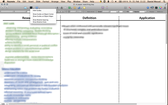
I had to smudge the text as it is still (and probably will always be) unpublished.
Keynote works very well for this kind of task, especially if you consider a few things:
- There is more than “presentation size”
The default size of the slides is nice for presentations — after all, this is what is was meant to be for. But if you want to develop something, a size of — for example 1538 x 2000 (Inspector – Document – Slide size (Custom slide size)) works better. - Disable the guides
While the guides that indicate when two objects are, e.g., left aligned, are very helpful for creating presentations, they are dysfunctional when you develop something. First, they “force” you to unnecessary neat work. Second, once you have a lot of elements on a slide, they slow the program down. You can disable them in the bar on top of the program.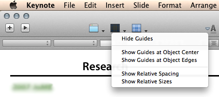
Disable the guides to work quicker. - Show the full slide
Especially if you use Keynote to develop something in a group (simply use a projector to throw it on the wall and write down the contributions of everyone), use the whole screen. Simply disable the Navigator/Outline by selecting Slide Only.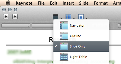
Show only the slide to have more space to develop the ideas. - Use Colors to convey information
To differentiate between the 5 sources used, we used colors. Simply write the name of a source in one color, then add all elements of that source in the same color. You can either create new textfields, or — quicker — copy & paste the text field with the source name (or a dummy text field with one word in it) and write the information in it. I highly recommend using a gaming mouse where one button works as double-click, this way you simply click on the text with the double-click button and you can simply write over the text. - Use graphics
Note that you can easily use images as well — keynote makes this fairly easy. - Learn more about sketching at work
There is an interesting book on how sketches can help you to be more productive. See the posting here.
In short, Keynote (or PowerPoint, if you do not use a Mac) are ubiquitously available programs that allow you to work visually and share the results with colleagues. There are, of course, more powerful solutions. For example, Tinderbox or Curio were developed for more visual work. Others can be used collaboratively online, for example, GroupZap (see posting here) or GoogleDraw. And you can work offline with MagicCharts or the like (see posting here).
But for quick, digital visual work Keynote works just fine.