Making fun of Zootoday is like shooting fish in a barrel; it’s morally wrong, but it’s still fun.
http://photoshopdisasters.blogspot.com (some comment)
If there’s one political party in Germany that would — on paper — be close to my political values, it would be the FDP. My main moral foundation is freedom, and on paper, that’s what this party is for. They are the classical-liberal “Free Democratic Party”.
But paper and reality differ … and sometimes paper is the problem.
They had some strange campaign ads, but recently, I was curious about the upcoming general election in September and had a look at their campaign presentation (I’d wish it was a hoax, but it looks real). Given that it is in German and painful to watch, let’s look at three screenshots from that video with a few spontaneous comments:
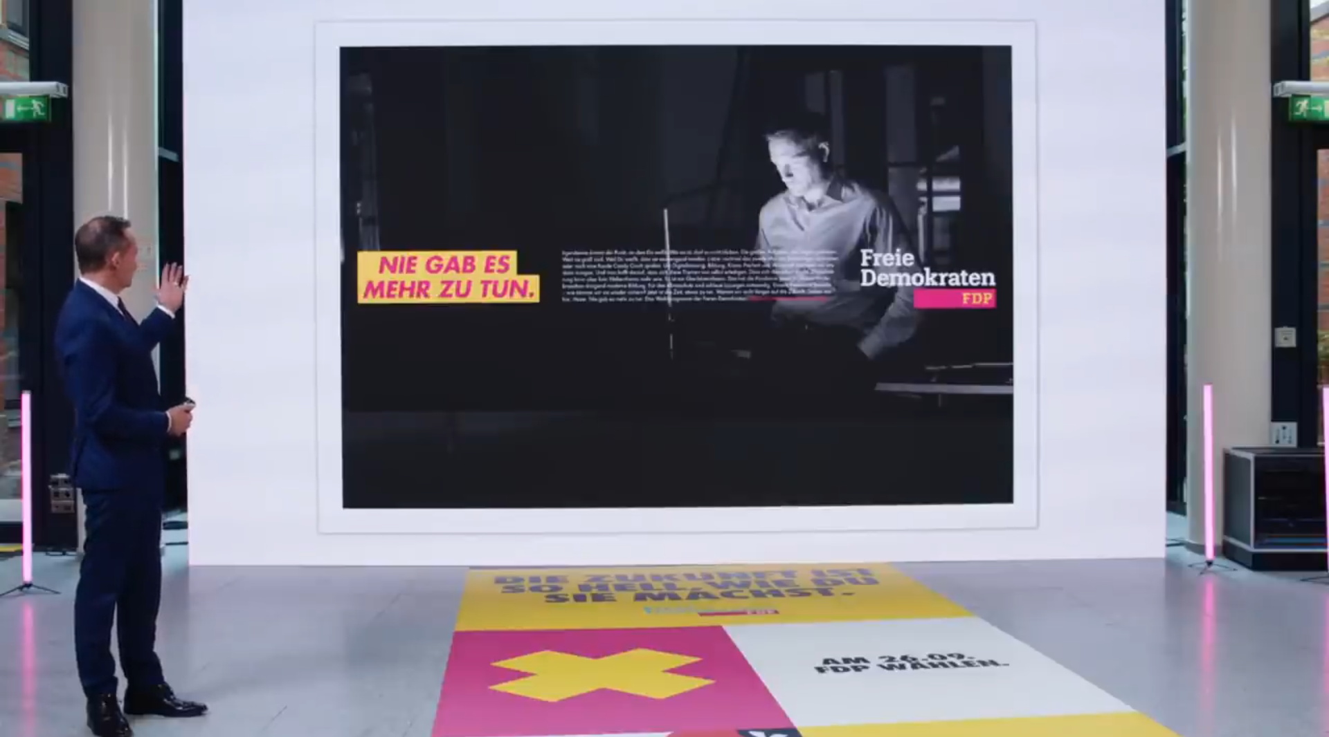
Who the hell came up with this design? One small strip with text in the vertical middle? Even if this is supposed to be a poster (these huge ones), with text that is still so small, you have to stand to read it. And who came up with the slogan “Nie gab es mehr zu tun.” (roughly: “Never was there more to be done.”). It screams that someone didn’t do their job and you are an established party, whether you are part of the government or not. Would I trust you with getting it done? Looking at that poster — nope. Also, not a very motivating sentence. My guess is that many are tired of the Covid regulations and other issues (e.g., flooding). Seriously, who is the target audience here?
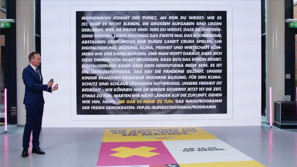
I hope that this is only a cut from a poster and not the poster itself. Even as a cut, it’s atrocious. That’s something a person with InDesign or Affinity Publisher (hell, even Keynote or PowerPoint) can crank out in five minutes. And while I like justified text, to do the hyphenation that it requires is … a bold choice. But yeah, it’s a boring desert of text, with the motto in yellow. Yikes. And yeah, there’s a photo in the background, but why?
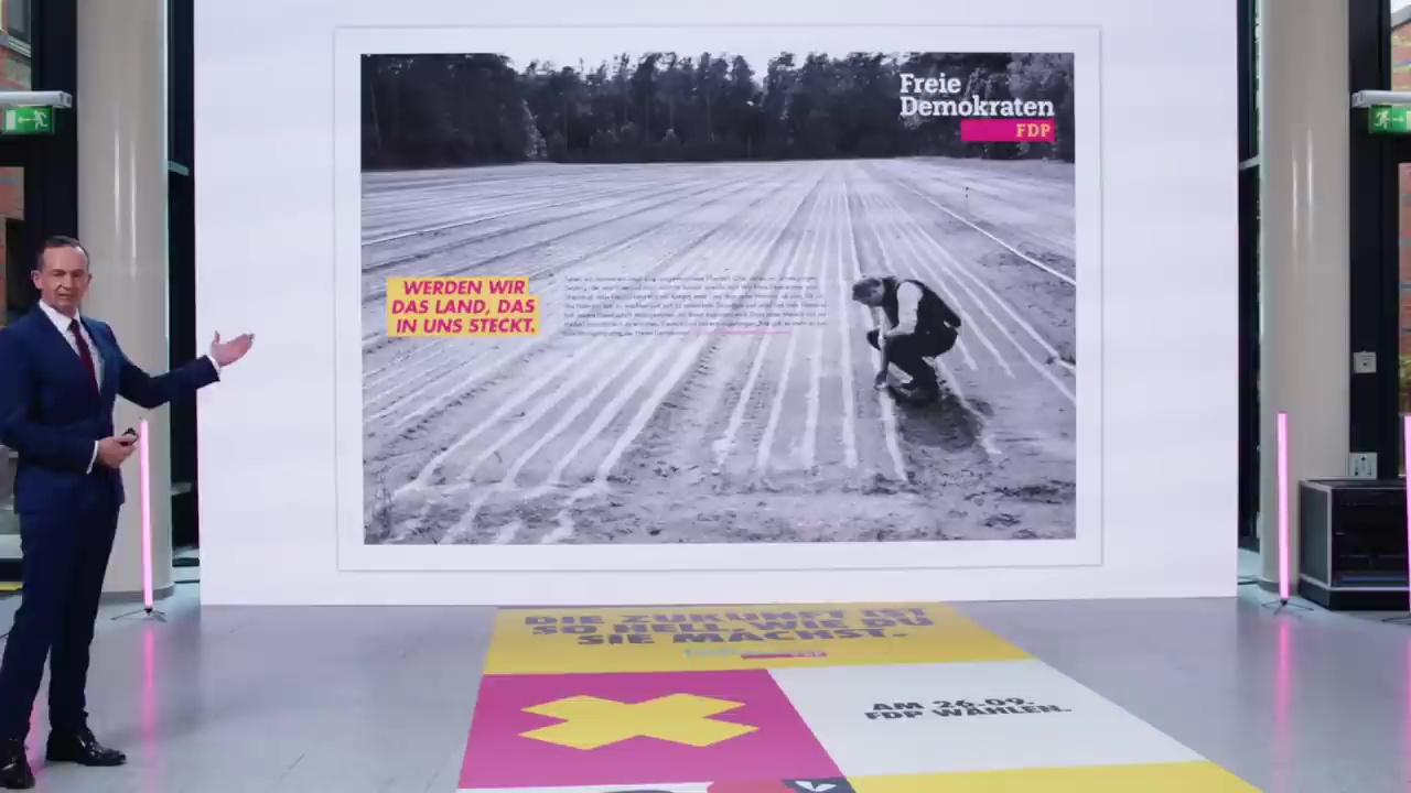
If the campaign did not look depressive enough, then that poster would put the nail in the coffin. Again with the strip of information the vertical middle. But the whole greyscale photo (did someone think that having green in it would be an endorsement of the so-called “Green Party”?) … with the kneeling person looking at the (according to the presenter some cool modern) field — yikes. That is a pose I usually associate with people with severe autism or depression.
It’s very hard to keep at least some level of politeness in this rant, but seriously, to adapt an old insult, I could eat crayons and shit better posters. How can a major party consider this a good campaign design? I mean, the party’s color scheme is difficult enough (switching to magenta in 2015) — but you don’t have to make it worse.
I can only guess it was a group decision. A shame, considering that the values — on paper — deserve better (otherwise I wouldn’t be so … ranty).
Update: Small changes, mostly spelling. Ranting and spelling correctly … hard to do.
Update 2: Sleeping on it for a night, I can but wonder — do they want to be elected? Or are they happy as a small party?