Good design is a lot like clear thinking made visual.
Edward Tufte
As written in this posting, DEVONthink presented an upgrade from DEVONthink 2.9.16 to DEVONthink 3.0. And yeah, it does have a lot of new features and design improvements. But what they also did was remove a view on the data, which was almost exclusively used by a lot of users (judging by the amount of activity in that thread in DEVONthink’s forum).
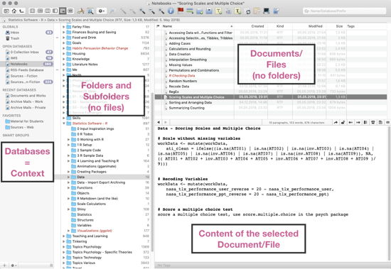
The Three Panes View:
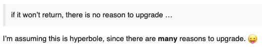
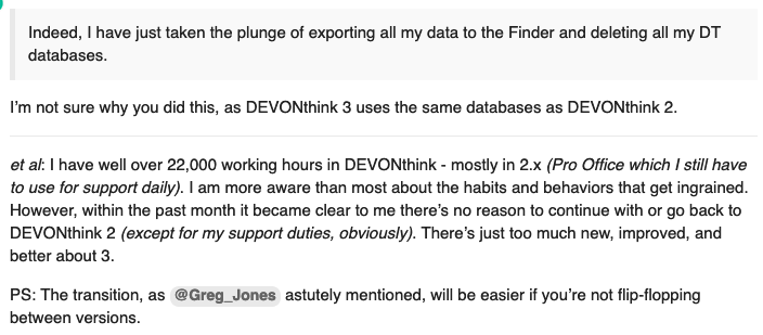
Removing a crucial view (for many users, including me) on the data is one thing and bad enough. What’s even worse is how people representing the support in the forum try to rationalize the decision:
or
or
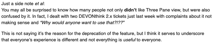
while apparently (for other issues) seeing the heterogeneity:
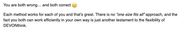
It’s interesting that apparently, different working styles are expected and DEVONthink is apparently flexible, but this does not extend to one axed design element. First of all, again: DEVONthink is a great company. Their software is/was super useful. It was levels better than Mac’s Finder and made it possible for me to handle my digital life. But I get two impressions from the discussion:
- I wonder about user testing, and esp. the role of in house usage of DEVONthink. It shouldn’t be too hard to get a representative sample of DEVONthink users, from occasional users to hard-core power users, and from different areas with different requirements, and with different affinity for technology interaction. But I wonder what kind of testing they did with their new interface and people’s actual workflows. And I wonder whether they eat their own dogfood/drink their own champagne. Do they actually use it — for heavy stuff, for actual work? Not just for one specialized purpose like customer support, but to keep one’s digital life? Do they look at users who do? Not just asking them, but inviting them with their notebooks/visiting them, or using Screen Sharing? I wouldn’t be surprised if their map of their customer base and usage scenarios has some missing spots.
- I wonder about their overall approach. In contrast to Papers for Mac (beautiful design, great “cite while you write” feature, but also highly unstable software — eventually ditched it for Zotero) or Circus Ponies Notebook (great software, again beautiful design, one serious bug that occasionally killed data, thus distrusted it more and more, but company folding happened first) DEVONthink not only has/had great features, but also excellent quality control and usability. Sure, it made it hard to see the power of it, and user experience could be worked on, but once you did see what it could/can do — waow. Now they seem to stumble. Focusing on one aspect (e.g., no previews in iOS Files app), narrowly solving it (creating previews as background task) but producing another issue (bye-bye, 50 GB). Same with the Three Panes View: Apparently, some users were confused and it does not really fit into the design (according to some), so it gets removed — ignoring those who not only use it but need it.
Well, at least for a while I can use DEVONthink 2.9.16. And at least DEVONthink isn’t a data island. I can export my data quickly. But I’d lose a lot of functionality:
- Much better way to work with files than finder, by selecting the context (database), the folder, the documents in the folder, the content of the document — all in one great three panes layout. See image above.
- Working sync of selected databases. Sure, struggles occasionally, but works okay’ish. Allowing my to carry my work stuff and literature and notes with me. Would be very hard to find a good replacement, esp. considering that I can sync with an USB cable.
- Easy creation of notes and finding the content with rtf files. Serve me well, can include links to other rtf files, or other apps. Highly usable.
- Great search function, surpassing Finder. Esp. given the quick selection of searching for the name of a file or searching in file content, and selecting the scope of the search.
- And much more.
I get that the developers and programmers are proud of their new features, of the way they imagined interaction with data to be. And that it might look ugly (incl. in the code) to reintroduce something that was decided to omit. But when hard-core power-users tell you something is missing, don’t let the guys in the forum try to defend your design decision. If you have to explain a design, it has failed. Granted, that always was a problem for DEVONthink — you don’t see its power. But it had that power. Castrating the software is not the way to go.
Perhaps this is a storm in a teacup. Perhaps after getting the post-release bugs out of the way, DEVONthink will give users a better view on their data back (and fix it’s iOS preview image fuckup). I’m still hoping for the best.